Specifically Annual Family Photo Album design … or any album that you’re trying to fit A LOT of pictures into while still maintaining a clean design aesthetic.
Formerly, I yammered on and on about the importance of getting your photos off your hard drive and into a family album. Today I want to talk briefly about good, simple, clean design principles that will help you put a lot of photos into a book in an aesthetically pleasing way.
So let’s look briefly at what doesn’t work best, first. Here are three not-so-good double page spreads from a couple of my earliest books:


These spreads (pictured above) have the following problems: no focal point, no “eye flow” (ie. your eye doesn’t know where to go first, next, last), no white space, too “busy”, and the two pages don’t look as if they were designed together (specifically, the pictures don’t “line up” from one page to the next). They just feel and look kind of chaotic.
So from these spreads that illustrate what NOT to do, here are my
3 Simple Rules for Good Design:
1. WHITE SPACE IS YOUR FRIEND!!!!2. Design double page spreads together, not separately.
3. Have a focal point and a “flow” that your eyes can follow.
Let’s look at what that means in terms of putting photos together on a page.

Also from an early family photo album, this spread (above) is altogether different from the former ones. My eye knows exactly where to go, smoothly right across both pages. There’s calming-restful-abundant white space. The pictures line up. No chaos. Of course, there’s also only four pictures. How do these simple design rules work with LOTS of pictures? Next exhibit …
This layout has 10 pictures; one is clearly dominant. Your eye will go there first. There’s plenty of white space on the opposing page, where your eye will naturally go next and probably move in a clockwise motion thru the simple grid of 9 pictures.
Here are more examples of one dominant photo + a grid of photos surrounded by white space and/or copy (BTW, quick note about copy: put it towards the outside of the pages; don’t bury it between photos).


Clearly, I utilize this simple form of layout often. The good news is: several of the consumer level book printers also utilize this design and make it available in their Drag-n-Drop pre-designed pages.
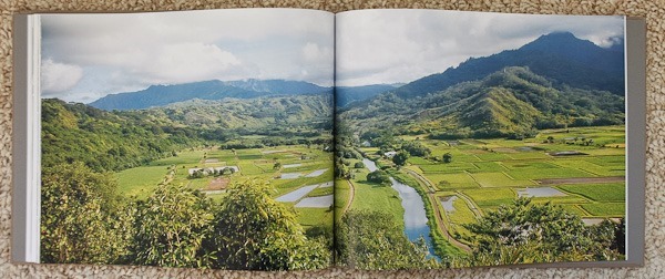
So what if you need to have lots and lots of photos – way more than 10 – on some spreads? In those instances, I tend to throw out the necessity of a focal point, and I just make one big grid or chaotic collage. I then redeem myself from breaking my own rules by making sure the page before & after are “calmer” pages, maybe even a huge double page spread of just one photo.


Another example … this is two single pages of two different evenings. Notice: I definitely designed the double page spread together. There is lots of white space. The eye naturally moves thru the photos from left to right.

So, let’s recap:
BAD:

Way BETTER:


So, to summarize: it is possible to create an aesthetically pleasing family photo album, even when you’re showcasing a whole boatload of photos in it. Just remember that white space is awesome, double page spreads should be designed together, and, if possible, one photo should stand out from the rest (usually by being bigger).


No comments:
Post a Comment