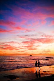
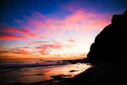
Leave God's artistry as is...? (I know, when I put it like that....!!)
 |  |
Or enhance it a little bit ...? (not changing, just adding a bit of saturation)
 |  |
So, on to the tip ...
Last week (yesterday's post) at the harbor I photographed the sun as it was actually setting. Last night we arrived AFTER the sun had already set. But the show in the sky was SPECTACULAR (generally Oct & Nov are the favored sunset months in SoCal). So here's my (again, totally obvious) tip for the day: your best sunset shots will happen in the 30-45 minute time span AFTER the sun dips below the horizon.

16 comments:
Hi Susan
I definitely like the top pictures best. The enhanced versions lose the beautiful turquoise shade in the sky.
The bottom ones look a bit oversaturated to me. I think what you captured in camera looks pretty awesome.
Susan, I like the top pictures too (but I like the arrangement of the bottom pictures---w/ the couple pic first).
Hugs & Blessings!
The first group looks awesome. The second group looks fakey.
Like MamaChanga mentioned, I do like the arrangement of the second group best. My eye automatically focuses on the large photo when it comes first to the point where I barely notice the second one.
I like the second set best. Love the blue of the sky and the way that it makes the rocks pop. Also, the blue saturation makes the couple stand out more. They are really lost in the shadows of that first set.
I also like the top set best and as suggested just put the smaller picture first. The second set just does not look natural.
I bought a new camera the other day. Nothing fancy like yours but a step up for me. Still a Sony Cyber Shot but with better zoom and more pixels and added bells and whistles. Most of my picture taking these days is at Disneyland so I can hardly wait to go and play with my new toy :)
I think I'm a sucker for a little extra saturation. All beautiful shots, as usual!
me too, on top but bottom arrangement. the bottom photos look good too, but your business is photographing people and the realistic scene works best for that IMO.
Both versions are amazing. I can't choose. How's that for an answer?!
I thought the originals were beautiful, but the enhanced versions blow me away. Love the extra saturation!
beautiful! the feeling in the top photos makes me just want to sit down, dig my feet into the sand, and stare with my jaw hanging.
I do love them both - but I'm also a fan of the greater saturations!
Thanks, All, for the input.
So, listening to y'all, what I did was: desaturate the second set a bit, and I used the second arrangement of photos.
Thanks for the tip! I was able to capture an awesome sunset pic tonight thanks to you!
I love natural and tweaked, but I think I like a little added saturation just a little more. You can't go wrong though!
Natural pics best, as mentioned on Flickr. :-)
I was going to say a little extra saturation never hurt, but I might go for a happy medium. Sounds like that's just what you did!
Post a Comment