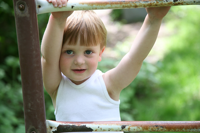
Here's my SOOC image. I like it. Lots. But it has some pretty hefty color casts that I'm not sure I can fix. Which, of course, makes it a perfect contender for b/w conversion.

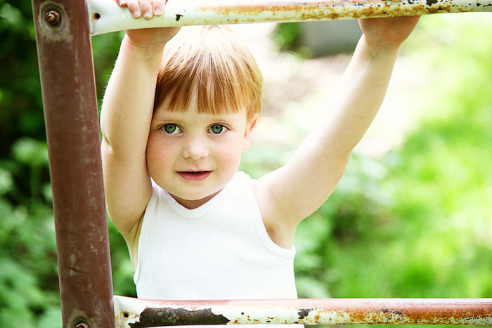
But first, let's try color:

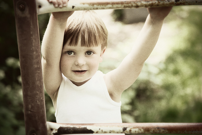
Here's my first sepia-ish b/w:

Still playing around ... and a recipe:

TRA Recipe: Old School Std 70% + Warm-it-up Kris 40% + Oh Snap 35%
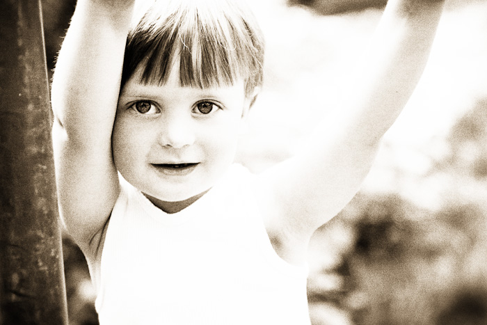
And, perhaps my favorite, a cropped version of above:

TRA Recipe: above recipe + B1tch1n B/W + Warm-it-up Kris + Contrast


22 comments:
i love your cropped version too! But they're all great. I have a sickness when it comes to editing photos... I just can't stop! ;)
I don't know what it is, but I really have a thing for color lately. I can't bear to turn very many photos in to sepia or B&W. All of your edits are lovely, but I happen to like the color best. :)
Ah-ha, Warm it up, Kris, is a great idea for a sepia tone! I went with Boring Sepia, then had to work with it some more. Love the final product!
those all look so wonderful!
btw.. that first color conversion is spectacular. really.
Beautiful image! Thank you so much for posting the editing process!
Love love love them -- thanks for sharing your "recipe" too! :-)
that last one really focuses on the eyes! I love the sepia one, and like the one after it quite a bit too.
These are beautiful. I really like the second from the end though. The muted colours seem to make the little boy come to life.
He is such a cutie. Love the final version. Such a beautiful picture. Thank you for walking threw your steps.
Sigh, love them all!
Oooo... those are great! Thanks for sharing how you did it. You ROCK! :)
I always LOVE your photos. And though I don't often comment, I don't miss a post (since way before I heart faces.) Actually you are the reason I even found I heart faces.
Just wanted to says thanks for doing what you do here!
What great edits
what a gorgeous photo. i like the second one the best b/c his eyes just pop! he is such a little sweetie!
Rachel (My Picture Perfect Life)
These are all so stunning, how do you choose?
You just amaze me. I think that is a great question up there. How do you choose? When you are showing a family their proofs do you show them the black and white and the sepia and the color?
beautiflly done!
it is like a language that I am unable to speak, but want to SO SO badly! someday maybe! Love all the shots..Shi~
I need to write down your TRA recipes...they are so very cool! (Especially since it's YOUR fault that I purchased them in the first place...hee!) I am just amazed at how many of their actions I love and adore.
I can't decided between the last two! I love that vintage color, but the crop on the very last one. They are all so pretty. Fun fun!
Amy
Co-Founder
I Heart Faces
I love the color, i have an unhealthy love of that bright green it pulled out in the greenery behind him. I would have lightened the eyes up a little bit to. Love it! what a sweet kid!
Post a Comment