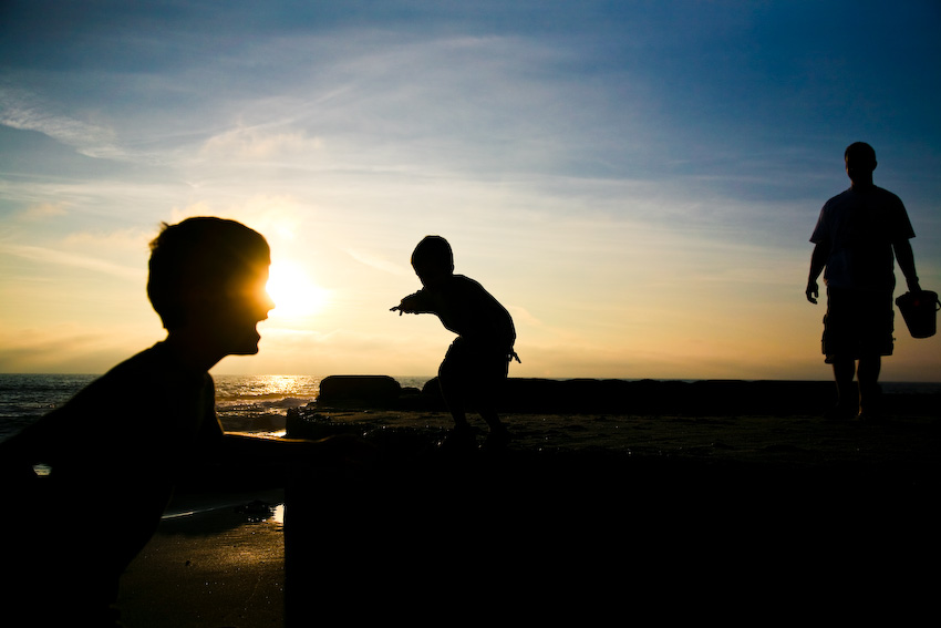

And not just my boys. Me too. Because Darcy did it again. She new and improved me. She redesigned my blog header and matched the fonts to my photography site. She gave me a wider main body and a spiffy navigation bar at the top that I can easily change or update whenever I want. AND ... she gave me three more columns, too. What? You don't see them? They're down at the bottom of my blog, where I'll have all sorts of fun filling them in with goodies.
Darcy-
I'm filled with gratitude all over again. Thank you so much!

15 comments:
Susan-- your new look is gorgeous! Of course, I loved the old one, too, but now, it's even better... you & Darcy really do amazing work!
Hope you have a blessed week... enjoy!
WOW! Susan this is awesome! I think I am a little envious of all your picture space! It's just gorgeous!
Great job Darcy!
Lookin' good Susan. Darcy rocks!
It looks really nice, as do the fun pictures! I like the nice texture/color on the sides of the blog.
Wow, that's so cool! And I love how you have the three columns at the bottom! Beautiful! Darcy did it again!!!
Very nice! I like the little slice of the header photo as a footer. Great touch!
The photos are beautiful, as usual. :) Darcy is so talented! She did a great job.
I love your new blog layout!!! It is perfect!!!
Awww, gee whiz. *blush* Thanks.
Such gorgeous photos need a pretty place to put them!
xoxoxo
I like the wider main body = bigger pictures! Delicious-looking gingerbread houses too...
Darcy is wonderful! I love her.
And I love your site. It looks great!
spiffy spiffy layout. Ü
How did I get this far behind? I love your new look! And I LOVE the 3 columns in the footer.
Beautiful, beautiful shots, Susan! Your photography is terrific.
I love the new look! Darcy is wonderful. Your pcitures are magnificent!
Patricia
Post a Comment